Tuesday 18 May 2010

App alert

There's an unbelievable amount of apps for the iphone it's ridiculous, however, I still plan to join this huge family with my own creation.
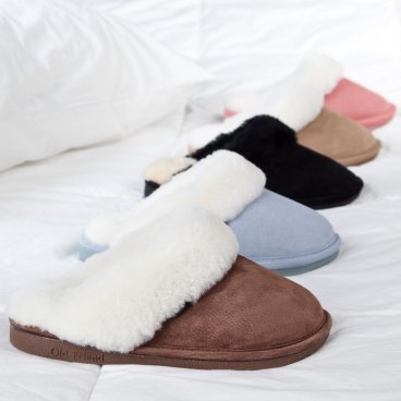
My plan is to create an app for my brand of shoes.. slips. The idea behind this brand, is a two in one combination of slippers and sports shoes for the elderly to use. An almost alternative to slippers if you wish.


I've been thinking what my app would consist of, so, as you do, I went for a browse on the app store to get some ideas from existing applications.
I came across 'Barratts', a well known shoe shop.
The ''homepage'' consists of various options to choose from to find a pair of shoes; 'find your shoes', 'your perfect pair', 'collections', 'new arrivals', and 'trends'.
I've chosen to focus on being able to customise your own pair of shoes, which can then be titled and saved.
My plan is this..

Download app > Create account > Login > Variety of options to choose from

'My shoes' (shoes which have been created by you) > Edit, save, publish (for others to see), buy, back to home

'Create shoe' (colours, patterns, type) > Save, buy, publish, back to home

'Browse shoes' (created by others) > rate, write review (if purchased), buy, back to home

'Find your perfect pair' (range of recommended patterns/colours by age) > rate, write review (if purchased), buy, save (to my shoes), back to home

Thursday 13 May 2010

Parts of a shoe


It's been really interesting reading about the different parts of a shoe. The definitions are making it reasonably simple to write descriptions for my each of my posters. I've been trying to relate object which associate with older people to sports shoes.

Sole
The bottom of a shoe is called the sole.

Insole
The insole is the interior bottom of a shoe, which sits directly beneath the foot. Many shoes have removable and replaceable insoles, and extra insoles are often added for comfort (to control the shape, moisture, or smell of the shoe) or health reasons (to help deal with defects in the natural shape of the foot or positioning of the foot during standing or walking).

Outsole
The outsole is the layer in direct contact with the ground. Dress shoes have leather outsoles; casual or work-oriented shoes have outsoles made of naturalrubber or a synthetic imitation. The outsole may comprise a single piece, or may comprise separate pieces of different materials. Often the heel of the sole is rubber for durability and traction, while the front is leather for style. Specialized shoes will often have modifications on this design: athletic cleats have spikes embedded in the outsole to grip the ground; many kinds of dancing shoes have much softer or harder soles.

Midsole
The layer in between the outsole and the insole that is typically there for shock absorption. Some types of shoes, like running shoes, have another material for shock absorption, usually beneath the heel where one puts the most pressure down. Different companies use different materials for the midsoles of their shoes. Some shoes may not have a midsole at all.

Heel
The bottom rear part of a shoe is the heel. Its function is to support the heel of the foot. They are often made of the same material as the sole of the shoe. This part can be high for fashion or to make the person look taller, or flat for a more practical use.

Vamp/Upper
Any shoe has an upper part that helps hold the shoe onto the foot. In the simplest cases, such as sandals or flip-flops, this may be nothing more than a few straps for holding the sole in place. Closed footwear, such as boots, sneakers and most men's shoes, will have a more complex upper. This part is often decorated or is made in a certain style to look attractive.

Lateral/Medial
The outside part of the shoe is referred to as the lateral and the inside facing part of the shoe is the medial. This can be in reference to either the outsole or the vamp.

Info-graphics

Seen as my designs seem to include a touch of info-graphics, I've been having a look to see what I could find that uses the same kind of style I'm looking to use.
I found this first image similar to what I want to do. Part of me wants to keep it as simple as possible, using only a single image; a photograph of which I will take, and some descriptive text.
I like how this poster keeps the text at the bottom, and keeps it very controlled. I probably wont have as much text as this, but I like how it's been arranged.

The second poster I found is again, very simple. They have used the same object I want to use in mine, so it's interesting to see how they've used it. It gives me a good idea as to how it already looks, and how I can change it to look 10 times better. :)
I think the text is poorly laid out, so I'll most definitely be staying away from that design.

Existing branding

Browsing through logo designs which have been used for clothing/shoe stores aimed towards older people, it's interesting to see that they are all similar. Although a few are rather fancy, the majority of them have been created simply by using the name of the store.
There's a range between serifs and sans serifs. The branding using serif typefaces are the cheaper shops, so I guess I'll keep that in mind whilst I carry on designing my logo. The product I'm advertising needs to be at a decent price as it's aimed indirectly towards the elderly through their close relations.


Monday 10 May 2010

Custom Kicks

I found this book in the library the other day and it's got some pretty interesting stuff in it. I got it, obviously, because it's relevant to my subject. Although my product will be for the elderly, I wanted to explore every possibility available.
I like how each piece of footwear, whether it be trainers, high heels or flip flops, have been customized to suit the needs of the client, or the person who will be wearing them.


To customize something for a specific reason can be special depending on what it is.
These high heels, styled in the fashion of 1940's and 50's aeronautics are beautifully designed. They have been photographed in a major airport which is shown in the book, to illustrate the point in the customization.


Finding this is amazing! It's exactly what I aim to do in this project; create something new out of an existing item. It looks like a groovy pair of shoes to wear, something I've also taken into consideration when designing.


I find these interesting and amusing. I like how they've taken advantage of the left and rightness.

'35 questions'


I was browsing through books in the library and came across a lovely looking folder full of information to do with things to look out for when designing for visually impaired and elderly people. I'm only really interested in the elderly part, although the diseases some older people get could be something I take into account as my product would have to be fit for these people also.

The folder is titled; '35 questions to ask yourself when designing for visually impaired and elderly people.'

'Good design is paramount to the success of any new product. Considering the needs of all potential users is not only an attribute of good design, it also has the potential to increase product sales. Design is particularly important for visually impaired people. Imagine buying a microwave if you were a visually impaired person. If all the controls were the same size and shape and were flush with the surface of the microwave, it would be impossible to distinguish one function from another. Would you but it? The checklist below will help you develop products that can be used by blind or partially sighted people, but will also help to make them easier for everyone to use.

Handling
Is the product easy to orientate?
Could a V.I. and/or an elderly person easily locate the front, back, top, and bottom of the product?
Does the product require much physical strength to use? - Consider for example, an elderly person with arthritis - would they be able to lift, open, turn, grip or rotate the product to use it effectively?
Does the product have any sharp edges, rough surfaces or finger traps?

Consider that older people may take longer to learn new things, make information choices, and to understand complex control panels, since their information processing skills may be that of younger people.

Consider using clear, uncomplicated fonts in a mixture of upper and lower case lettering and a minimum of 16 point in size.
Consider materials used. Is the ink going to rub off and become illegible with time? Are the materials very shiny, making printed information difficult to read due to reflections, and causing discomfort glare?
Are controls visible and easily distinguishable? - Consider large buttons, varied shapes and sizes, and colour contrast.
Do the colours contrast enough? - Consider the contrast of buttons, controls and printed labels against their backgrounds.

Tuesday 4 May 2010

Stop motion


I've been thinking about stop motion, and how much I enjoyed using this method of animation. I'm going to try something similar to the video above, only I will be using a more specific type of shoe which will be sending my specific message.
I haven't yet put any great thought into what kind of music or sound effects. I want to nail the actual animation first, although I have a few tunes playing around in my head.

Slippers


I have chosen to concentrate soley on the amount of comfort sport shoes give. I want them to be a positive alternative to your every day slippers. They will be targetted indirectly towards people in the older generation, therefore I've been having a look at what kind of slippers they use.
I want to amalgamate the two types of shoes to create one, which as I said, will be a a compfy alternative to slippers.


Looking at older people's slippers, I can see that they seem as though they prefer their feet to be as covered as possible. They are fairly fluffy, and come in a range of pastley colours; blue, pink, brown etc.


As if this project wasn't as humorous enough as it is, I could play on this a little more by exaggerating parts of the shoe to ensure people can see that the shoe has been made partly by a slipper.

Monday 3 May 2010

Inspiration?


I've found it useful looking at existing work as I've been a little confused with what to do. Seeing all these though have inspired me and I've got plenty of different ideas buzzing around in my head!

I like how illustration has been used as well as photography to create this ad. The 'amateur' look brings it back to life.


I'm really interested in creating something new from an existing object, just like what someone has done below. I've put this into practise a few times, and I've found it very enjoyable. It's fascinating to see what can be made.


There are some fairly boring ''ads'' for sports trainers, however, seeing this has given me a few ideas for what I could do.
I like how this is has been photographed. It makes the product look swish!


Again, this is similar to one of the images above, although it's using a different kind of approach to creating something new out of the same object.
I can't say I'm a huge fan of this tactic, however it's an interesting approach.


I found this interesting. I couldn't find any information as to why someone's decided to make a trainer out of keyboard buttons, but it's an engrossing concept. I could do something similar, obviously minus the buttons, but with something which is relevant to the message I'm trying to give.

Saturday 1 May 2010

Found illustration

I've been browsing through illustrations other people have done of the elderly. I came across this by Dannielle Murphy. I did have a quick search for her but couldn't find any information. I did find some other drawings she'd done which were quite interesting.
I like how she's used a different media to create this. There wasn't any description next to the piece of work, so I can only have a guess as to what she used. It looks very much like oil pastels. It has a very textured look to it.
I like the way in which she's incorporated colour. It's eye catching and interesting. I might have a go at using colour within my illustrations.


I very much like these illustrations. Three different perspectives of one profile. Using various angles of the same subject is an extremely interesting ''technique''. It shows how different things look.
These are really well drawn and must have taken ages to complete.


I absolutely LOVE life drawing! I've have a gander at some online.
At college before this course, I used to go to life drawing clases all the time, I just wish I had my drawings here. They'd be great primary research!
Charcoal is awesome for this kind of illustration. You can vary the weight to create really dark marks and use your finger to smudge to create a lighter effect. Rough marks can be made as easily erased. I love it!


Another life drawing. Again, it looks as though they've used charcoal to create this. The shading is really nice and seems very accurate. I can't say I'm keen on the outline. The subject would have light on a specific part of the body, giving it shadows and lighter areas purposely. Only the shadowed areas would have a dark edge, not the lighter parts. The outline, I feel, gives it more of a comic-book feel. It doesn't look right.
An eraser has most definately been used to lighten the brighter areas; another handy technique to know when life drawing.