Tuesday 30 November 2010

Adverts


I've been looking at some existing campaigns, and here's a few I've taken a liking to.

I'm not overly keen on the layout used for the type, but I do like how they've used a photograph with a distinct depth of field. It's nice to see just a little area of the photograph in focus. It almost highlights the most important parts.


Again, I like the photography used for this advert. It's close-up and clear, which helps deliver the message.


Two photographs which compare or show the difference (though not in this case) is a really nice way of showing change (again, not in this case).

I definitely want to play with these ideas for my own work.

A spot of videoage


Though this isn't a lovely subject, I found this video really interesting and clever. I had to rewind it to have another look at the masks, which I then matched with the guy you see at the end.


Friday 19 November 2010

Billboards


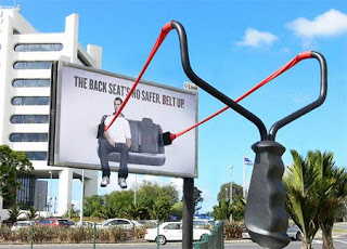
I found some really cool billboards!! I absolutely love the one with the guy tearing away the edge. It's such a simple and effective idea.


In context


Thought I'd whack up the images I used to create a vector outline which I used to display my posters. I wanted to keep them as simple as possible, but as interesting as possible also.


Monday 15 November 2010

Plant tags


I've been thinking about it, and I've decided I'm going to use the typefaces I've created to make some plant tags. I want my work to get a feel for the museum just by looking at the work I produce. It's all very well putting the museum's logo on stationary which would sell within the museum shop, but this doesn't represent the museum as a whole very well.

Looking at existing tags and labels for plants, I can see that though they are made using different stocks and have different designs, they all used for the same purpose and the way in which they are used are also similar. They are to be put in the ground, which stands next to the plants.
As there are too many plants to know the names of, I won't be able to ''personalise'' each tag. I think I will stick to my theme; seasons, and play on this idea.

I think creating tags is a great way for me to experiment with form and context again. I can't wait to get started!

I like the idea of being able to write on the tags and possibly change the names when needed, so this is another route I could explore.


Saturday 13 November 2010

WHSmith

Whilst in WHSmith's the other day, I came across a set of Stephen King books which looked laaaaavly.
I like the simplicity and order of these books. Though they're more illustrative and "rough", they're still as simple as mine will be.